Sefaria in Gephi: Seeing Links in Jewish Literature

How do you visualize 87,000 links between Jewish texts?

The answer, at least when one is working on an ordinary iMac, is very slowly.

The better–by which I mean more accurate and productive–question is: How do you meaningfully visualize the relationships between over 100,000 individual sections of Jewish literature as encoded into Sefaria, a Living Library of Jewish Texts?

The key term for me is meaningfully – working at this scale means I have to get out of my network comfort zone and move from thinking about the individual nodes and their ego networks towards a holistic appreciation of the network as a structural entity. I’m not able to do that quite yet, at least not in this post. This is the first post in a series of explorations  – what kinds of graphs can I make with this information and what information can I get from it (or read into it)?

This project and, perforce, this series is another side of the research questions that I’m currently grappling with – how do the formal attributes of digital adaptations affect the positions we take towards texts? And how do they reorganize the way we perceive, think about and feel for/with/about texts?

Because this is Ludic Analytics, the space where my motto seems to be “graph first, ask questions later,” it seemed an ideal place to speculate about what massive visualizations can do for me.

Let’s begin with a brief overview of Sefaria. Sefaria is a comparatively new website (launched in 2013) that aims to collect all the currently out-of-copyright Jewish texts and not only provide access to them through a deceptively simple interface, but also crowd-source the translations for each text and the links between them. For example, the first verse of Genesis (which we will return to later) is quoted in the Talmud (one link for every page that quotes it), has numerous commentaries written about it (another link for every commentary), is occasionally referenced in the legal codes and so on. Here’s a screenshot of the verse in Sefaria.

Genesis 1:!

Sefaria Screenshot

You can see, along the sides, all the different texts that reference this one and, of course, if you visit the website, you can click through them and follow a networked thread of commentaries like a narrative. Or like a series of TVTropes articles.

Sefaria did not invent the hyperlinked page of Rabbinic text. Printed versions of the Bible and the Babylonian Talmud and just about every other text here–dating all the way back to the early incunabula–use certain print conventions to indicate links between texts and commentaries, quotations and their sources. The Talmud developed the most intricate page by far, but the use of printing conventions such as font, layout and formal organization to show the reader which texts are connected to which and how is visible in just about every text here.

What Sefaria does (along with any number of other intriguing things that are not the topic of this post) is turns print links into hyperlinks and provides a webpage (rather than a print page) that showcases the interconnectedness of the literature. Each webpage is a map of every other text in Sefaria that connects to the section in question, provided that someone got around to including that connection. Thus we see both the beauty and the peril of crowdsourcing.

So the 87,000 links to over 100,000 nodes that I was given (thank you @SefariaProject!) are not exactly a reflection of over 2,000 years of Jewish literature as such, but a reflection of how far Sefaria has come in crowdsourcing a giant digital database of those 2,000 years and how they relate to one another. That caveat is important and it constrains any giant, sweeping conclusions about this corpus (not that I, as a responsible investigator, should be making giant sweeping conclusions after spending all of two weeks Gephi-wrangling). Having said that, the visualizations are not only a reflection of Sefaria’s growth, but also a way to reflect on the process of building this kind of crowd-sourced knowledge.

But before subsequent posts that analyze and reflect and question can be written, this post in all its multicolored glory must be completed.

To return to my very first question,  how do you visualize 87,000 links?

Like this:

Sefaria in OpenOrd

Figure 1


This is Sefaria. Or a cell under a microscope. It’s hard to tell. Here’s the real information you need. This graph was made using the Gephi plugin for OpenOrd graphing, a force directed layout optimized for large datasets.* The colors signify the type of text. Here’s the breakdown.

Blue – Biblical texts and commentaries on them (with the exception of Rashi). Each node is a verse or the commentary by one author on that verse.

Green – Rashi’s commentaries. Each node is a single comment on a section

Pink – The Gemara. Each node is a single section of a page.

(Note – these first 3 make up 87% of the nodes in this graph. Rashi actually has the highest number of nodes, but none of them have very many connections)

Red – Codes of Law. Each node is a single sub-section.

Purple – The Mishnah. Each node is a single Mishnah.

Orange – Other (Mysticism, Mussar, etc.)

The graph, at least as far as we can see in this image, is made up almost entirely of blue and pink nodes and edges. So the majority of connections that Sefaria has recorded occur between Biblical verses and the commentaries, the Gemara and Biblical references and the Gemara referencing itself.

Size corresponds to degree – the more connections a single node has, the larger it is. The largest blue node is the first verse of Genesis.

On the one hand, there is an incredible amount of information embedded in this graph. On the other hand, it’s almost impossible to read. There are some interesting things going on with the patterns of blue nodes clustering around pink nodes (the biblical quotations and their commentaries circling around the pages of the Gemara that reference them, perhaps?), but there are so many nodes that it’s hard to tell.

There’s also a ton of information not encoded into the graph. Proximity is the biggest one. There is absolutely nothing linking the first and second verses of Genesis, for example. Arguably, linear texts should connect sequentially and yet the data set I used does not encode that information. So this data set conveys exclusively links across books without acknowledging the order of sections within a given book.

But, as I told my students this quarter, the purpose of a model is not to convey all the information encoded in the original, but to convey a subset that makes the original easier to manage. This model, then, is not a model of proximity, It is purely a model of reference. Let’s see what happens when we look at it another way.

Sefaria All X-InD Y-OutD BC Book

Figure 2

Gephi does not come with a spatial layout function, but there are user-created plugins to do this kind of work. This is the same dataset as above, except arranged on a Cartesian plane with the X axis corresponding to In Degree (how many nodes have that node as a target for their interactions) and the Y axis corresponding to Out Degree (how many nodes have that node as a source for their interactions).** The size corresponds to a node’s Betweenness Centrality – if I were to try and reach several different nodes by traveling along the edges, the bigger nodes are the nodes I am more likely to pass through to get from one node to another.

The outlier, obviously, is Genesis 1:1. It has far and away the most connections and, especially based on its height, is the source for the greatest number of interactions. (That probably means that, out of all the information Sefaria has collected so far, the first verse of Genesis has the most commentaries written about it). It’s not the most quoted verse in Sefaria, that distinction belongs to Exodus 12:2 (the commandment to sanctify the new moon, for those who are wondering). Second place goes to Deuteronomy 24:1 (the laws of divorce) and third goes to Leviticus 23:40 (the law of waving palm branches on Succot).*** So for this data set, most quoted probably signifies most often quoted in the legal codes in order to explicate matters of law. And while the commentaries tend to focus on some verses more than others, the codes seem to rely almost exclusively on a specific subset of verses that are related to the practices of mitzvoth. I think I was aware of this beforehand, but the starkness of the difference between Genesis 1:1 and Exodus 12:2 is still surprising and striking.

Working with Betweenness Centrality as a measure of size was interesting because it pointed towards these bridge texts – statistically speaking, Genesis 1:1 is the Kevin Bacon of Sefaria. You are more likely to be within 6 degrees of it than anything else.

There are a few other interesting observations I can make from this graph. The first is that the Gemara is ranged primarily along the Y axis, suggesting that the pages of the Gemara are more rarely the target for interactions (which is to say that they are not often quoted elsewhere in Sefaria) ,but more often the sources and, as such, quote other texts often and have substantial commentaries written about them. Because one of the texts quoted on a page of Gemara is often another page of Gemara, you do see pages along the X axis, but none range as far along the X axis as along the Y. While there are texts that are often the target of interactions, the Gemara is, overall, the source.

This is in contrast to the Biblical sections, which occupy the further portions of the X axis (and all the outliers are verses from the five books of the Torah). So the graph, overall, seems to be shading from pink to blue.

Which brings me to another limitation in my approach. Up until now, I have been thinking about these texts as they exist in groups, using that as a substitute for the individual nodes that would ordinarily be the topic of conversation. So what happens when I create a version of the graph that uses color to convey a different kind of meaning and no longer distinguishes between types of texts?

Sefaria All X-InD Y-OutD BCsize Dcolor

Figure 3

Sefaria, taste the rainbow.

In this graph, color no longer signifies the kind of text, but the text’s degree centrality. The closer to the purple end of the rainbow, the higher number of connection the node has. Unsurprisingly, Genesis 1:1 is the only purple node.

It’s interesting to note that the highly connected nodes on the right of the graph are all connected to a large number of lower level nodes. There are no connections between the greens and yellows near the top of the page and the blues down on the right. Why is there such a distinction between nodes that reference and nodes that are referenced? Why is the upper right quadrant so entirely empty? Does this say something about the organization of the texts or about the kinds of information that the crowd at large has gotten around to encoding? Or is it actually a reflection of the corpus – texts that cite often are not cited in turn unless they are in the first book of the Torah?

If you have any questions, thoughts, explanations, ideas for further research with this data set or these tools, suggestions for getting the most out of Gephi, please leave your comments below.

Coming soon (more or less): What happens when we look at connections on the scale of entire books rather than individual verses?

Bonus Graph: A Circular graph with Genesis 1:1 as the sun in what looks like a heliocentric solar system. Why? Well, it seemed appropriate.

Genesis 1-1 Concentric Graph Book MC

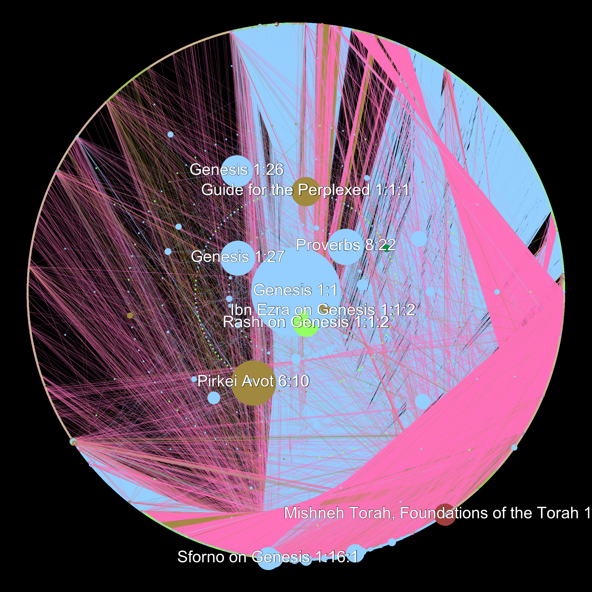
One note on this graph. You can see the tiny rim of green all around the right edge – those are the tiny nodes that represent Rashi’s commentaries and make up more than 1/3 of all the nodes in the graph. The inner rings, at least what we can see of them, tend towards Biblical verses and their commentaries. The Gemara is almost all on the outside. Of course, those distances are artifacts of deliberately placing Genesis 1:1 at the center, but they are interesting nonetheless.

*Force directed, to provide a very brief summary, means that the graph is designed to create clusters by keeping all the edges as close to the same length as possible. Usually it works by treating edges as attractive forces that pull nodes together and the nodes themselves as electrically charged particles that repulse one another.

**At least in this data set, the source is the text under discussion, so if one were to look at the connection between Genesis 1:1 and Rashi’s commentary on Genesis 1:1, the Biblical verse is the source and the commentary the target. Conversely, if one were looking at a quotation from Genesis in a page of the Gemara, the page of Gemara would be the source and the verse in Genesis the target.

***Based on further explorations of the data set according to less fine-grained divisions, I am convinced that anything having to do with the holiday of Succot is an outlier in this dataset. More on that in another post.

#engl236 and The Future of DH as Envisioned by my Classmates

I’m not usually a prolific tweeter. I tend to find between 1 and 5 interesting tweets each day (or every other week when I get distracted) and retweet them. But Tuesday, as those of you who follow me might have noticed, was an exception. I decided to try my hand at live tweeting the end-of-quarter project presentations in Alan Liu’s ENGL 236 class, “Introduction to the Digital Humanities”. The assignment: write up a detailed grant proposal for a Digital Humanities project and, if possible, provide a small prototype . The results were spectacular and I know I did not do them justice in 420 characters (I limited myself to three tweets per project – two for the presentation and one for the Q&A). But this is not a post about my first experience live tweeting, which was quite an experience and a really valuable exercise in attention and brevity. This is a post about the assignment itself and the kinds of ideas that it generated.

First, though, I should probably speak about my place in this class. I wasn’t in it. I wasn’t even officially auditing it. I just showed up every week because it was held in my* lab in between my office hours and because I was deeply curious what exactly an introduction to the digital humanities was. Additionally, as my lab responsibilities include holding office hours and providing support for those engaged in digital and new media projects, it seemed wise to remain abreast of what the class was interested in doing.

That meant, however, that while everyone else was gearing up to present their final projects, I was relaxing because there was no assigned reading for the week. In one sense, I did not actually have to be there. In another sense, this was the most important class of the term.

This was the class about imagining the future. This was the moment when my colleagues–many of whom probably still would not define DH as one of their fields–advanced proposals for projects that they thought were interesting, that they would find useful in their scholarly work and in whose creation they would like to participate.

What is so interesting about these projects is that they represent a microcosm of the kinds of projects humanist scholars would like to see available. If we make the assumption that we design imaginary projects that we wish exist for our research–a fair assumption, especially given how often the presenter related their project to dissertation work in progress–then these mock prospectuses become a window into what humanists would do with DH if they had “world enough and time.”

Obviously, this is not a representative sample, but it is an interesting starting point. What points of intersection appear in these projects? What elements of digital inquiry have been left out entirely? What kinds of things do my peers want to be able to do?

If you missed the tweets, I’ve Storified them here (or you can just check #engl236). If you would like to see the actual proposals rather than simply my summaries, they can be found at Project Prospectuses along with the full text of the assignment.

So here’s my take on the projects as a whole.

First, the people want databases. Eleven of the fourteen projects began with the creation and maintenance of a database. Often, they proposed a database of media, sometimes crowdsourced, where as many examples as feasible of that media would be located and available for comparison.

That was the second thing in common with nearly all of these database projects. Built in to the database itself were the tools necessary to sort, reorganize and analyze the data. This isn’t just about making it easy to track down the media the make up large scale analyses, it’s about making it easy to perform the analyses themselves.

For example, Percy proposed a database of legal documents with a built-in stop list that specializes in sorting out the excessively common legal terms that pepper court documents, but would be meaningless from a semantic standpoint. This kind of project makes it easy for someone with little legal training to go in and work with these texts. The “hard work” of figuring out how to cope with reams of legalese has already been done.

Here’s another example. Dalia and Nicole suggested a database of fairy tales called Digitales that aims to collect multiple versions of each fairy tale–both published and crowd-sourced versions in order to try and maintain a sense of transmission and orality–and includes tools that compare different versions of the same story as well as tools to compare the same figure across multiple tales. One could, I imagine, discover once and for all, “what does the fox say?” There are tools for this kind of analysis out there and similar kinds of databases as well. But a nontrivial amount of effort goes in to finding, cleaning and uploading the text…and then debugging the analyses. And, because all the systems in place to disseminate pre-cleaned texts are still invisible to the average scholar, this process is either repeated every time a new student wishes to study something or dismissed as too complex.** A project like this makes it easy to do research that, as of now, is still something of a pipe dream for most scholars.

Digitales will also include a timeline element so that the user can trace the evolution of a particular story over the ages. This is one of several projects (5, if I recall correctly) that are interested in spatializing and temporalizing knowledge. Nissa’s project, DIEGeo, aims to not only collect data on early 20th century, expatriated writers from the paper trails they leave behind, but also create an interactive timeline that displays which writers were where at what point in time. As with the fairy tale database, DIEGeo wants to literalize the way we “see” connections between authors. We can observe how the interwar authors move through time and space (without the use of a TARDIS), which opens up new avenues of charting influence and rethinking interactions.

Display, see, watch…these are are the verbs that make up these projects. I’ll throw in one more–look. These projects change the way we look at knowledge production. They prioritize organizing the texts and images and (meta)data that make up our cultural and textual artifacts in such a way that it becomes easy to ask new questions merely by looking at them. Because the preliminary research is already done (mapping all of French New Wave cinema in real and imaginary space, e.g.), it becomes possible to start asking larger scale questions that investigate more complex forms of interaction.

So here are the questions that humanists would be asking if the infrastructure was up to it. These are all projects that are buildable in theory (and, in Gabe’s case, in practice), but that require serious computational and infrastructural support. A lone scholar could never build one of these and, even having built it, afford to maintain it. But, these projects seem to say, just think of the critical and pedagogical opportunities that would arise if we had these databases at our disposal.

Now for the flip side of the question. What is absent?

With the very notable exception of Juan’s ToMMI  (pronounced toe-me) tool for topic modeling images, there were no analytic tools proposed. Many of the databases incorporated already extant tools (and, in a larger sense of the term, one could argue that the database itself is a tool). Still, in retrospect, I’m surprised to see so few suggestions for text analysis tools or, even better, text preparation tools. Why?

And here’s the bit where I extrapolate from insufficient data. I think it’s harder to conceptualize and defend a tool than a database. Many of the text analysis tools already exist and why write an $80,000 grant proposal for something that someone else has already done?

On the other hand, how do you conceptualize a tool that hasn’t been invented yet? What would an all-in-one text prep tool look like?*** And would it even be possible to create one? And, even if you did, could you easily defend why it was interesting until you actually used it to produce knowledge? I can make an argument for the particular kind of knowledge that each of these projects creates/uncovers/teaches. But the tools that we need to make text analysis approachable are difficult to argue for because the argument comes down to “this makes text analysis easy and that will, hopefully, provide interesting data”.

As Jeremy Douglass, the head of Transcriptions, points out, many digital projects begin with the goal of answering critically inflected questions about the media they study and quickly become investigations into the logistics of building the project. This is, arguably, a feature rather than a bug. As Lindsay Thomas and Alan Liu pointed out at Patrik Svensson’s talk on “Big Digital Humanities”, our problem with data isn’t that it’s big, it’s that it’s messy. So, to apply Jeremy’s articulation of the situation in a way that hits close to home for me, the first question one must answer when transforming one or several novels into social network graphs is not “what patterns of interactions do we find?” but, “does staring at someone count as an interaction?” 19th century heroes do a lot of staring. Is that a different kind of interaction from speaking? Can and should I code for that? Will a computer be able to recognize this kind of interaction? Does that matter to me? At that point, two years might have gone by and one has an article about how to train a computer to recognize staring in novels, but has barely begun thinking about the interpretive moves one had planned to make regarding patterns of interactions. This is a critical step in thinking. It helps us answer questions we never even thought to ask. It changes the way we think about and approach texts. It forces us to stretch different muscles because technological (and sociological and economic) affordances matter and constraints, as the OuLiPo movement argues, may be necessary to do something innovative.

The downside is that we get caught up in answering the questions we know how to answer. Which is what is so fantastic about these project proposals and why I find them so compelling. They get to grapple with these problems without losing sight of why they do so. Corrigan dealt with this explicitly when presenting on MiRa, her mixed race film database. How, she asks, do we construct a database of mixed race when race itself is constructed? The project becomes a way of thinking about material and cultural constructions through the making of this database that is itself both a form of critical inquiry and an object of it.

I see all these proposals as the first steps in answering Johanna Drucker’s article in the most recent DHQ, where she offers suggestions towards “a performative approach to materiality and the design of an interpretative interface. Such an interface,” she argues, “supports acts of interpretation rather than simply returning selected results from a pre-existing data set. It should also be changed by acts of interpretation, and should morph and evolve. Performative materiality and interpretative interface should embody emergent qualities.”

Now all we need to do is get them built. But that, I think, is a task for another day. Winter break is about to begin.

~~~

*For a given definition of the term.

**I will easily grant that there are a number of problems with making texts that have been chunked, lemmatized, stripped of all verbs, de-named, etc. available and that doing so will open them up to misuse. I also think that the idea of a TextHub based off of Github (or even using Github for out of copyright materials) where different forms of text preparation are forked off of the original and clearly documented should be embraced by the DH community.

***I may be showing my hand here, but I really want one of these.

Revisiting the Social Networks of Daniel Deronda

My twitterstream overflowed, in the past few days, with tweets about the uses, misuses and limits of social networking.* Coincidentally (or perhaps not, given the identity of at least one retweeter), we discussed the role of social network graphs in humanistic inquiry in this week’s session of Alan Liu’s “Intro to Digital Humanities” class. For those of you following along, we are #engl236 on Twitter and, last week, we made graphs. So I am going to interrupt my glacial progress through the possible uses of R**and put the longer-form meditation on what I am trying to do with these experiments in statistical programming on hold in order to talk about my latest adventures in social network graphing.

As longtime readers of this blog will remember, this is not my first foray into Social Network graphing. Nor is it my second. This gave me a huge advantage over many of my colleagues (sorry!) because I had already spent hours collecting and formatting the data necessary to graph these kinds of social networks. Since I wasn’t going to map new content, I thought I would at least learn a new program to handle the data. So I returned to Gephi, the network visualization tool that I had failed to master 18 months ago.

And promptly failed again.

PSA: If you have Apple’s latest OS installed, Gephi will not work on your machine. I and two of my classmates discovered this the hard way. Fortunately, the computers in the Transcriptions Lab are–like most institutional machines–about an OS and a half behind and so I resigned myself to only doing my work on my work computer.  After some trial and error, I figured out how I needed to format the csv file with all my Daniel Deronda data and imported it into Gephi. After some more trial, more error, and going back to the quickstart tutorial, I actually produced a graph I liked. Daniel Deronda in Gephi

In this graph, size signifies “betweenness centrality” which is a marker of how important a circle is in the graph according to how many connections the node has and how often that node is necessary for getting places in the network (i. e., how often the shortest path between two other nodes is through this node), which means that the node’s size indicates how vital that person is to other people’s connections as well as how many connections they themselves have. Color signifies grouping. Nodes that are the same color are nodes that have been grouped together by Gephi’s modularity algorithm…which is Gephi’s function for dividing graphs into groups.

So here we see three groups, which can be very roughly divided into Gwendolen’s social circle, Deronda’s social circle and Mirah’s social circle. There’s something delightful about the fact that the red group is made up entirely of the members of the Meyrick family and the girl they took in (Mirah). So Mirah truly becomes a member of the Meyrick family.

As this is a comparative exercise, I’m less interested in close-reading this graph and more interested in thinking through how it compares to yEd.

Gephi is certainly more aesthetically pleasing than yEd, especially given the settings I was using on the latter. And, unlike yEd, Gephi can very easily translate multiple copies of the same interaction into more heavily weighted lines, which helps provide a better idea of who speaks to whom how often in the novel (something I had been struggling with last year). At the same time, yEd’s layout algorithms seem far more interesting to me than Gephi’s “play around with Force Atlas until it looks right” approach. So while the layout does, I think, do a decent job of capturing centrality and periphery, it is less interestingly suggestive than yEd.

The other failing that Gephi has is the lack of an undo button. This might seem trivial to some of you, but being able to click on a node, delete it from the graph and then quickly undo the deletion was what made it so easy for me to do “Daniel Deronda without Daniel (and, erm, Gwendolen)”. With Gephi, I have this paranoid fear that I will lose the data forever and it will automatically save and I’ll have to do all this work over again. After a while, I finally screwed my courage to the sticking place and deleted our main characters to produce the following three graphs.

Daniel Deronda without Daniel inGephi

Daniel Deronda without Daniel

Daniel Deronda without Gwendolen

Daniel Deronda without Gwendolen

Daniel Deronda without Either

Daniel Deronda without Daniel or Gwendolen

The results are interesting, although perhaps less interesting than the disk-shaped diagrams from yEd that demonstrated changes in grouping. yEd allowed for some rather fine-grained analysis about who was regrouped with whom. On the other hand, Gephi makes it clear that both Gwendolen and Deronda tie together groups that, otherwise, are more distinct, as shown by the sudden proliferation of color in the first and third graphs particularly. Gephi makes it easy to see Deronda’s importance in tying many of the characters together. His influence on the networks is far stronger than Gwendolen’s.

Now, for the sake of comparison, here are the Gephi and yEd graphs side by side.

Daniel Deronda Gephi and yEd Comparison

I have not yet performed a more complete observational comparison of the layout, centrality measures and grouping algorithms in Gephi versus yEd (which, I admit, would begin with researching what they all mean) and the relationship between how data is presented and what questions the viewer can ask, but here are my preliminary reactions. Gephi does a far better job of pointing to Deronda’s importance within the text while yEd is better at portraying the upper-class social network in which Gwendolen in enmeshed. And while Gephi’s layout invites the viewer to think of its nodes in terms of centrality and periphery, yEd’s circular layout structures one’s thought along the lines of smaller groups within networks. Different avenues of inquiry appear based on which graph I look at.

This comparison produces three different questions.

  1. How do you know when to use which program? Can one tell at the outset whether the data will be more interesting and approachable in Gephi, e.g., or is this the perfect application of the “guess and check” approach where you always run them both and then decide which graph is more useful for the kinds of questions you want to ask. Are my conclusions here, about Gephi’s focus on centrality versus yEd’s focus on group dynamics, representative?
  2. How meaningful are the visual relationships one perceives in the network?
    1. Let’s take the graph above as an example and go for the low-hanging fruit. Young Henleigh, the illegitimate son of Grandcourt is way down at the bottom of the graph, connected unidirectionally to his father (his father speaks to him, but he does not speak back) and bidirectionally to his mother, with whom he converses. Gephi has colored him blue, indicating that, at least according to Gephi’s grouping algorithm, he is more closely associated with the other blue characters (a group made up predominantly of those who show up in Daniel’s side of the story and who I am valiantly resisting calling the Blue Man Group). Arguably, this is because those in Deronda’s circle talk slightly more about the boy since they have heard rumors of his existence, while those in Grandcourt’s social circle have not. And Henleigh’s repulsion distance is another indicator of how Grandcourt ignores his son and keeps his family at a distance.
    2. That is, I think, a fair reading of the book Daniel Deronda. My conclusions are borne out in the text itself and are justifiable within the larger narratives of Grandcourt’s treatment of others, a topic that I’ve written about several times over the course of my graduate career. But is it a fair reading of the graph? Am I taking accidents of layout as purposeful signals? Or are my claims, grounded as they are in edge distance and modularity, reasonable?
  3. In addition, did the graph actually tell me this information in a way that the book did not or did it simply remind me to look at what I already knew? This is part of an old and still unanswered question of mine – will the viewing of the social network graph ever really be useful or is it the decisions and critical moves that go into making the graph that produce results?

Obviously, this last question only applies to work like mine, where the graph is hand-coded and viewed as a model of an individual text. In cases where this work is mostly automated and several hundreds of novels are being studied for larger patterns of interactions, the question of whether the graph or the making thereof produces the information is irrelevant.

But the question of what kinds of meaning can be located in layout and pattern is still crucial, especially when one is comparing how different networks “look”. This may be a particularly pernicious problem in literary criticism and media studies: we’re trained to look at texts and images and treat them as…intentional. Words have meaning, pictures have meaning and we talk about this larger category of “media objects” in a way that assumes that their constituent parts have interpretable significance. This is not the same as claiming authorial intentionality, it’s simply an observation that, when we encounter a text, we take it as given that we can make meaning using any element of that text that impinges on our consciousness. There are no limits regarding what we can read into word choices, provided we can defend our readings and make sense out of them. Is that true of graphs? Are we entitled to make similar claims by reading interpretations into features of the layout and with the only test of said interpretation’s veracity our rhetorical ability to convince someone else to buy it? For example, could I claim that Juliet Fenn’s position on the graph between Deronda and Gwendolen shows that she, and all that she stands for, comes between them?  My instinct is to say no. But the same argument about place applied to a different character makes perfect sense. Mordecai’s place is between Deronda and the group of Jewish philosophers on the far right is emblematic of how he connects Deronda to his nation and how he is the one who rouses Deronda’s interest in Zionism.

I can think of three off-the-cuff responses to this problem. The first is to say that location is a fluke and, when it corresponds to meaning, that’s an accident. This feels unsatisfying. The second is to say that there is something about Juliet Fenn that I’m missing and, were I to apply myself to the task, I could divine the reason behind her placement. This is differently unsatisfying, not because I don’t think I can come up with a reason, but because I am afraid that I can.*** And if I succeed in making a convincing argument, is that because I unearthed something new about the book or because I’m a human being who is neurologically wired to find patterns, a tendency exacerbated by my undergraduate and graduate training in the art of rhetorical argument? In short, the position that all claims that “can” be made can be taken seriously is only marginally less absurd than the claim that all layout elements are always meaningless and, consequently, any meaning we make or find is insignificant. The third response heads off in a different direction. Perhaps my discomfort with reading these networks lies not in the network, but in my own lack of knowledge. I have not been trained in network interpretation and I need to stop thinking like a literary theorist and start thinking like a social scientist. I need to learn a new mode of reading. This, while perhaps true, also leaves me dissatisfied. I am not, fundamentally, a social scientist. I am not looking for answers, I’m looking for interesting questions/interpretive moves/ideas worth pursuing. While it would be very cool to show, in graph form, how Mordecai’s ideology spreads to Daniel and how ideas act as a kind of positive contagion in this novel, that theory is not stymied if there is insufficient data to prove it. I can take imaginative leaps that social scientists responsible for policy decisions must absolutely eschew.

Which means it is time to think about a fourth position. If we, as scholars of media in particular, are going to continue doing such work, then we need a set of protocols for understanding these visualizations in a manner that both embraces the creativity and speculative nature of our field while articulating the ways in which this model of the text corresponds to the actual text. Such a set of guidelines would  be useful not only as a as a series of trail markers for those of us, like me, who are still new to this practice and unsure of where we can step, but also as a touchstone that we can use to justify (mis)using these graphs. If the sole framework currently in existence is one that does not account for our needs, we may find ourselves accused of “doing it wrong” and, without an articulated, alternative set of guidelines, it becomes exponentially more difficult to respond. On the most basic level, this means having resources like Ted Underwood’s explanation of why humanists might not want to follow the same steps that computer scientists do when using LSA available for network analysis. Underwood explains how the literary historian’s goal differs from the computer scientist’s and how that difference affects one’s use of the tool. Is there a similar post for networks? Is there an explanation of how networks within media differ from networks outside of media and advice on how to shift our analytic practice accordingly? Do we even have a basic set of rules or best practices for this act of visualizing? And, if not, can we even claim these tools as part of our discipline without actually sitting down and remaking them in our image?

I don’t want to spend the rest of my scholarly career just borrowing someone else’s tools. I want Gephi and yEd…and MALLET and Scalar and, yes, even R to feel like they belong to us. Because right now, for all that I’ve gotten Gephi to do what I want and even succeeded in building a dynamic graph of the social network of William Faulkner’s Light in August (which told me nothing I did not already know from reading the book), I still feel like I’m playing in someone else’s sandbox.

*Granted, this is Twitter and so three posts, each retweeted several times, can make quite a little waterfall.

**I will say that the R learning curve made figuring out Gephi seem nearly painless by comparison.

***In the interest of proving a point, a short discussion of Juliet Fenn: Juliet Fenn’s location between Deronda and Gwendolen and at the center of the graph is significant precisely because she is the character who represents what each of them is not. Juliet is of the more aristocratic circle defined by Sir Hugo and his peers and, unlike Daniel, actually belongs there by birth. She beats Gwendolen in the archery contest, which proves her authenticity both in terms of talent and, again, aristocracy. Were either Daniel OR Gwendolen authentically what they present themselves as (and, coincidentally, who their co-main-character perceives them to be), Juliet Fenn would be Gwendolen’s mirror and Deronda’s ideal mate. As neither Gwendolen nor Daniel are, in fact, who they seem to be, Juliet is neither. She is merely a short blip during the early chapters of the book who can be easily ignored until her graphic location discloses the subtle purpose of her character–the idea of a “real” who Gwendolen cannot be and Deronda cannot have. Of course, neither character explicitly wants or wants to be Juliet. This isn’t meant to be explicit, merely to color our understanding of the otherness of Deronda and Gwendolen. It’s not that Juliet Fenn keeps them apart per se, but the discrepancies between who she is and who they are, as illustrated by the graph, is what makes any relationship between Gwendolen and Deronda impossible.

Bar Graphs and Human Selectiveness

Two weeks worth of struggling with R and putting in my own texts (feel free to guess which one I used) has left me feeling less accomplished than I would have liked, but less filled with encroaching terror as well. I am capable of following instructions and getting results, so while the art of doing new things (and really understanding the R help files) is still beyond me, I think I have enough material to start talking about Daniel Deronda again.

Daniel Deronda is a text that seems split into two halves. One of the things I discover when I reread this book is that there are many more chapters than I remember with both Deronda and Gwendolen “on screen together”. So are these two separate stories or are they two utterly intertwined texts?

In order to test how separate the two storylines are, I looked at the word frequencies of both “Deronda” and “Gwendolen” in each chapter to see whether they were correlated. So, in this case, a positive value means that Deronda showing up in a chapter increases the likelihood of Gwendolen showing up while a negative correlation means the opposite.

The correlation between Deronda and Gwendolen is -0.465. (As a reminder, correlations run from 1 to -1). So that’s actually pretty high, given that book chapters are complex objects and I know that they interact a fair amount over the course of the book. But there’s actually a better way to test for significance. We can look at the likelihood of this correlation having occurred by random. Again, drawing on Text Analysis with R, by Matthew Jockers, I had R rearrange the appearance 10,000 times and then generate a plot of what the correlations were. Unsurprisingly, it looks like a normal curve:

Deronda_Gwendolen_Histogram

So if the frequency of each name per chapter was distributed randomly, you would be statistically likely to see little correlation between them. For those interested in some more specific numbers, the mean is -0.001858045 and the standard deviation is 0.1200705, which puts our results over 3 standard deviations away from the mean. That little blue arrow is -0.465.

All that says, of course, is that it’s highly unlikely that these results occurred by chance and that they are, in some sense, significant.* Which, to be fair, no kidding. My initial, subjective reading told me they were negatively correlated as well. And there has to be a better reason to do this kind of work than just to prove one’s subjective reading was right.

Which is where our next graph comes in. Now that I know that the two are negatively correlated, I can turn to the actual word frequency per chapter and see what the novel looks like if you study character appearance.

And, for fun, I threw in two other characters who I see as central to the plot to see how they relate.

Final Bar Graph of Name Frequencies


I highly recommend clicking on the graph to see a larger view.

Here’s where things get interesting to the human involved. The beginning of the novel happened exactly as expected – Eliot starts the story in medias res and then goes back to first tell us Gwendolen’s history and then Deronda’s. And then the name game gets more complicated about halfway through when Mirah and Mordecai** enter the picture. By the last few chapters, there is very little Gwendolen and the story has settled firmly around Deronda, Mirah and Mordecai. All of this, again, makes sense. But it is nice to see the focus of the book plotted out in such a useful manner and it invites two kinds of questions.

The first is based on the results; going to chapters with a surprisingly high mention of a certain character, like Deronda’s last few chapters, and attempting to figure out what might be going on that causes such results. Why, after all, is Daniel the only one to venture up into the 1.2% frequency? Is there something significant about the low results around 50 and 51? What’s going on there?

The second kind of questions that this graph invites are questions about me. Why did I choose these four characters? I think of them as the four main characters in the story and yet there’s certainly a good argument to be made for at least one other character to be considered “main”.

If you’ve read the book, feel free to guess who.

Why did I leave out the frequency data for Henleigh Mallinger Grandcourt?

Honestly, I completely forgot he was important. It’s not that I don’t remember that the Earl of Grantham had an evil streak in his youth, it’s simply that I don’t think of Grandcourt as a main character in the book. That might be because one doesn’t usually think of the villain as “the main character” or it might be because I am more interested in the story of Deronda and 19th century English Jewry.

As it happens, I noticed Grandcourt’s absence because of that odd little gap in Chapter 12 where absolutely no one is mentioned. What was going on there?

I went on Project Gutenberg, checked the chapter and said “Oh. Oops.” This is the only chapter entirely (and possibly at all) from Grandcourt’s perspective, hence no mention of any other character. So why didn’t I redo the graph with Grandcourt included, given that he’s important enough to have his own chapter?

Okay, yes, sheer laziness is part of the answer, but there is another reason. Chapter 12 is the chapter in which Grandcourt announces his intention to marry Gwendolen. And notice whose name entirely fails to appear in the chapter…

This data doesn’t exactly tell us anything new – we have ample proof from Eliot that Grandcourt is one of the nastiest husbands in the British canon. But this detail invites a way of looking at people’s interactions categorized by recognizing another person by the simple act of naming them, which makes this the second time that randomly playing around with visualizations has led me towards the question interpersonal interpellation as related to empathy. 

So what do you all think? What does the graph say to you? Do you think this is a valuable way of approaching a text? And am I getting kinda hung up on this question of simply naming as a measure of empathy?

Comment below!

* With the obvious caveat that this was a book written by a woman rather than a random letter generator so of course its results did not occur by chance, what this graph really lets us see is whether the negative correlation between the two characters allows for meaningful critical discourse. Anything under -0.5 is not really considered significant in scientific terms, primarily because it’s not useful for predictive validity, but because we’re not interested in predictive validity, we’re interested in the possibilities of storyline division, the graph validates the hunch that there’s some kind of distinction.

**SPOILER ALERT – Mordecai is actually the combined occurrence of the names Mordecai and Ezra, for reasons obvious to anyone who has read the book.


I Blog Therefore I Am Doing Something

There’s not much to report on the visualization front this week. I have created a couple of elementary (actually, closer to Kindergarten) graphs in R by following the instructions in Matthew Jockers’ excellent book, Text Analysis with R for Students of Literature, which is currently in draft form, but an excellent resource nonetheless. So I have learned some things about the relative frequencies of the words “whale” and “Ahab” and, more importantly, I’m gaining some insight into what else I could do with my newfound knowledge of statistical programming. But my studies in R are still very much at the learning stage and I have yet to reach a point where I can imagine using it in a more playful, exploratory sense. While this is not true of every tool, R is one of the ones that must be mastered before it can be misused in an interesting manner. Which is not to say that it cannot be used badly – I am getting good at that – but the difference between using a tool badly and playfully is a critical distinction. A playful framework is one that eschews the tool’s obvious purpose in order to see what else it can produce; a framework that validates a kind of “What the hell, why not?” approach to analysis. Playfulness exists when we search for new ways to analyze old data and disconcerting methods for presenting it. It can be found in the choice to showcase one’s work as a large-scale three dimensional art-project and in the decision to bring the history of two Wikipedia articles about the author into one’s examination of the text. It is not, more’s the pity, found in code that fails to execute.*

All this adds up to an apology: I have no intriguing word clouds for you this week. I don’t even have any less-than-intriguing word clouds this week. But I do have some thoughts about the nature of this blogging endeavor, nearly a year and a half after it was started.

This blog began as a way to record our visualization experiments in a forum where we could treat them as part of a larger group and where we would be forced to engage with them publicly. It was a way to hold ourselves accountable to our professor, to each other and to ourselves. At the same time, it was a way to provide all our visualizations (even the ones that did not make it into our final seminar papers) with a home and a life beyond our hard drives and walls.

The class has ended and the blog lives on. Last year, it was a place for me to think through a social-network graph of William Faulkner’s Light in August; a project that grew out of the work I did on Daniel Deronda. This year, it’s serving as a repository for experiments that I perform as part of my work in UCSB’s Transcriptions Center.

And throughout those different iterations, one element of common purpose stands out to me. The blog is a place for scholarly work-in-progress. It’s where projects that need an audience, but are not meant for traditional publication can go. It’s where projects that have reached a dead end in my mind and require a new perspective can be aired for public consumption. It is, at its most basic level, a way of saying “This work that I am in the process of doing is meaningful”.

And that, I think, is the real key to why I find maintaining this blog – despite my sporadic updating during my exam year – so valuable. Blogging about my work gives me a reason to do it. This might sound absurd, if not simplistic, but bear with me for a moment. Academia is a goal-oriented endeavor. We begin with the understanding that we finish our readings on time in order to have meaningful conversation about them in order do well in a course. We do our own research in order to write a paper about it in order, once again, to do well in a course or in order to present it at a conference. (Obviously, I’m not arguing that the only reason that anyone reads anything is for a grade, but the fact that graduate students turn said research into a well-argued paper within a reasonable time-frame is tied to the power of the grade.)  The books we read, the programs we learn, the courses we teach are oriented towards the dual goals of spreading knowledge in the classroom and publishing knowledge in the form of an article or monograph.

So where does practical knowledge within the digital humanities fit in? In the goal-oriented culture of academia, where is the value in learning a program before you have a concrete idea of what you will use it for? Why learn R without a specific project in mind? Why topic model a collection of books if you’re not really interested in producing knowledge from that form of macroanalysis? My experience with academia has not really encouraged a “for the hell of it” attitude and yet a number of the tools used specifically within the digital humanities require one to invest time and practice before discovering the ways in which they might be useful.

There are several answers to the above question. One that is used to great effect in this department and that is becoming more popular in other Universities as well is the Digital Humanities course. I am thinking in particular of Alan Liu’s Literature+ course, the seminar for which this blog was originally created. By placing digital training within the framework of a quasi-traditional class, we as students are introduced to and taught to deploy digital forms of scholarship in the same manner that we learn other forms of scholarly practice. If we master close-reading in the classroom, we should master distant reading in it as well.

And yet, what does one do when the class is over? Styles of human reading are consistently welcome in graduate seminars in a way that machinic readings are not. And there are only so many times one can take the same class over and over again, even assuming that one’s institution even offers a class like Literature+.

The alternative is to take advantage of blogging as a content-production platform. The blog takes over as the goal towards which digital training is oriented. Which is a very long way of saying that I blog so that I have something to do with my digital experiments and I perform digital experiments so that I have something to blog about. Which seems like circular logic (because it is), but the decision to make blogging an achievement like, albeit not on the same level as, producing a conference paper is one that allows me, once again, to hold myself accountable for producing work and results.

This year, “Ludic Analytics” will be my own little Literature+ class, a place where I record my experiments in order to invest them with a kind of intellectual meaning and sense of achievement. Learning to count incidences of “Ahab” and “Whale” in Moby Dick may not be much, but just wait until next week when I start counting mentions of “Gwendolen” and “Deronda”…

*I apologize for the slight bitterness, I spend half an hour today combing through some really simple code trying to find the one mistake. There was a “1” instead of an “i” near the top.

MALLET redux

I considered many alternative titles for this post:

“I Think We’re Gonna Need a Bigger Corpus”

“Long Book is Long”

“The Nail is Bigger, but the MALLET Remains the Same”

“Corpo-reality: The Truth About Large Data Sets”

(I reserve the right to use that last at some later date). But there is something to be said for brevity (thank you, Twitter) and, after all, the real point of this experiment is to see what needed to be done to generate better results using MALLET. The biggest issue with the previous run–as is inevitably the case with tools designed for large-scale analysis–was that I was using a corpus that consisted of one text. So my goal, this time around, is to see what happens when I scale up. So I copied the largest 150 novels out of collection of 19th and early 20th century texts that I happened to have sitting on my hard drive and split them into 500 word chunks. (Many many thanks to David Hoover at NYU, who had provided me with those 300 texts several years ago as part of his Graduate Seminar on Digital Humanities.. As they were already stripped of their metadata, I elected to use them.) Then I ran the topic modeling command in MALLET and discovered the first big difference between working with one large book and with 150. Daniel Deronda took 20 seconds to model. My 19th Century Corpus took 49 minutes. (In retrospect, I probably shouldn’t have used my MacBook Air to run MALLET this time.)

Results were…mixed. Which is to say that the good results were miles ahead of last time and the bad results were…well, uninformative. I set the number of topics to 50 and, out of those 50 topics, 21 were not made up of a collection of people’s names from the books involved.*  I was fairly strict with the count, so any topic with more than three or so names in the top 50 words was relegated to my mental “less than successful” pile. But the topics that did work worked nicely.

So here are two examples. The first is of a topic that, to my mind, works quite well and is easily interpretable. The second example is of a topic that is the opposite of what I want though it too is fairly easy to interpret.

Topic #1

First

So, as a topic, this one seems to be about the role of people in the world. And by people, of course, we mean MEN.

Topic #2:

Second

Now, this requires a some familiarity with 19th century literature. This topic is “Some Novels by Anthony Trollope”. While, technically accurate, it’s not very informative, especially not compared to the giant man above. The problem is that, while it’s a fairy trivial endeavor to put the cast of one novel into a stop list, it’s rather more difficult to find every first and last name mentioned in 150 Victorian novels and take them out. In an even larger corpus (one with over 1,000 books, say), these names might not be as noticeable simply because there are so many books. But in a corpus this size, a long book like “He Knew He Was Right” can dominate a topic.

There is a solution to this problem, of course. It’s called learning how to quickly and painlessly (for a given value of both of those terms) remove proper nouns from a text. I doubt I will have mastered that by next week, but it is on my to do list (under “Learn R” which is, as with most things, easier said than done).

In the meantime, here are six more word clouds culled from my fifty. 5 of these are from the “good” set and one more is from the “bad”.

Topic #3:

Third

Topic #4:

Fourth

(I should note, by the way, that party appears in another topic as well. In that one, it means party as a celebration. So MALLET did dinstinguish between the two parties.)

Topic #5:

Fifth

Topic #6:

Sixth

Topic #7

Seventh

Topic #8:

Eighth

There are 42 more topics, but since I’m formatting these word clouds individually in Many Eyes, I think these 8 are enough to start with.

So the question now on everyone’s mind (or, certainly on mine) is what do I do with these topic models? I could (and may, in some future post) take some of the better topics and look for the novels in which they are most prevalent. I could see where in the different novels reading is the dominant topic, for example. I could also see which topics, over all, are the most popular in my corpus. On another note, I could use these topics to analyze Daniel Deronda and see what kinds of results I get.

Of course, I could also just stare up at the world clouds and think. What is going on with the “man” cloud up in topic 1? (Will it ever start raining men?). Might there be some relationship between that and evolving ideas of masculinity in the Victorian era? Why is “money” so much bigger than anything else in topic #6? What does topic #7 have to say about family dynamics?

And, perhaps the most important question to me, how do you bring the information in these word clouds back into the texts in a meaningful fashion? Perhaps that will be next week’s post.

*MALLET allows you to add a stopwords list, which is a list of words automatically removed from the text. I did include the list, but it’s by no means a full list of every common last name in England. And, even if it was, the works of Charles Dickens included in this list would leave it utterly stymied.

Hammering at Daniel Deronda

This time, we are using a MALLET!

(I apologize for the pun, but it does not seem to get old).

MALLET stands for MAchine Learning for LanguagE Toolkit and is proof that, among other things, there is no such thing as an impossible acronym. MALLET is a Java-based package designed for multiple kinds of natural language processing/machine learning, including what I used it for – Topic Modeling.

So what is Topic Modeling? Well, let’s say that texts are made up of a number of topics. How many? That depends on the text. So every word in that text (with the exception of common words like “an” ) should be related to one of those topics. What MALLET does in topic modeling mode is it divides a set of texts up into X number of topics (where X is your best guesstimate on how many there should be) and outputs all the words in that topic, with a shorter list of top words for each topic. Your job, as the human, is to guess what those topics are.

For more on the idea behind topic modeling, check out Matthew Jockers’ Topic Modeling Fable for the decidedly non-technical version or Clay Templeton’s Overview of Topic Modeling in the Humanities.

Now for the second question – why am I doing it? Beyond the “well, it’s cool!” and “because I can,” that is, both of which are valid reasons especially in DH. And my third reason is a subset of the second, in a way. I want to test the feasibility of topic modeling so that, as this year’s Transcriptions Fellow*, I can help others  use it in their own work. But in order to help others, I need to first help myself.

So, for the past two weeks or so, I’ve been playing around with MALLET which is fairly easy to run and, as I inevitably discovered, fairly easy to run badly. Because of the nature of topic modeling, which is less interested in tracking traditional co-occurrences of words (i. e. how often are two specific words found within 10 words of each other) and more interested in seeing text segments as larger grab-bags of words where every word is equidistant from every other**, you get the best topic models when working with chunks of 500-1000 words. So after a few less-than useful results when I had divided the text by chapters, I realized that I needed a quick way to turn a 300,000+ word text file into 300+ 1000 word text files. Why so long a text? Well, George Eliot’s Daniel Deronda is in fact a really long text. Why Daniel Deronda? Because, as the rest of this blog demonstrates, DD has become my go-to text for experimenting with text analysis (and, well, any other form of analysis). So I have MALLET, I have Daniel Deronda, I now also have a method for splitting the text thanks to my CS friends on Facebook and, finally, I have IBM’s “Many Eyes” visualization website for turning the results into human-readable graphics. All that’s missing is a place to post the results and discuss them.

I knew Ludic Analytics would not let me down. So, without further ado, I present the 6 topics of Daniel Deronda, organized into word clouds where size, as always, represents the word’s frequency within the topic:

Topic 1:

Topic1

Topic 2:

Topic2

Topic 3:

Topic3

Topic 4:

TOPIC4

Topic 5:

Topic5

Topic 6:

Topic6


You will notice that the topics themselves do not yet have titles, only identifying numbers. Which brings us to the problem with Topic Modeling small text sets – too few examples to really get high quality results that identify what we would think of as topics. (Also, topic modeling is apparently better when one uses a POS (parts of speech) tagger and even gets rid of everything that isn’t a noun. Or so I have heard.)

Which is not to say that I will not take a stab at identifying them, not as topics, but as people. (If you’ve never read Daniel Deronda, this may make less sense to you…)

  1. Daniel
  2. Mordecai
  3. Society
  4. Mirah
  5. Mirah/Gwendolen
  6. Gwendolen

I will leave you all with two questions:

Given the caveat that one needs a good-sized textual corpus to REALLY take advantage of topic modeling as it is meant to be used, in what interesting ways might we play with MALLET by using it on smaller corpora or single texts like this? Do the 6 word clouds above suggest anything interesting to you?

And, as a follow-up. what do you make of my Daniel Deronda word clouds? If you’ve never read the text, what would you name each topic? And, if you have read the text, what do you make of my categorizations? 

*Oh, yes. I’m the new Graduate Fellow at the Transcriptions Center for Literature & the Culture of Information. Check us out online and tune in again over the course of the next few weeks to see some of the exciting recent developments at the Center. Just because I haven’t gotten them up onto the site yet doesn’t mean they don’t exist!

**This is a feature, not a bug. Take, for example, a series of conversation between friends and, in every conversation, they always reference the same 10 movies although not always in the same order. MALLET would be able to identify that set of references as one topic–one that the human would probably call movies–while collocation wouldn’t be able to tell that the first movie and last movie were part of the same group. By breaking a long text up into 500-1000 word chunks, we are approximating how long something stays on the same topic.

The Limits of Social Networks

Though we have mostly gone our separate ways over the past year, I find that I am attached to the idea of the LuAn collective and want to keep it going just a bit longer. After all, you never know when you might need a data viz blog that you co-run.

As a second year student in the English department at UCSB, I am gearing up to take (i.e. reading madly for) my qualifying exams this June. As luck would have it, I am also finishing up my course requirements this quarter, so I find myself in the…unenviable position of writing a paper on a topic that would ordinarily lie far outside my interests in the 19th century English novel: William Faulkner. So I did what any digital humanist with an unhealthy interest in visualization would do in my situation – I made a graph.

I wanted to write a final paper for this course that reflects my theoretical interests and would allow me to continue developing a subset of my digital skills. Of course, trying to get all of my interests to move in more or less the same directions is like herding kittens, but I had been seeking another opportunity to think through a novel using a social network graph and, well, I wouldn’t have to start from scratch this time. I knew how my graphing software, yEd, worked and I knew how long it took to turn a book into a collection of Excel cells denoting conversations (20% longer than you think it will take, for those of you wondering). So why not create a social network graph of one story in Yoknapatawpha?

Don’t answer that question.

Light in August is widely considered to be the most novel-like of Faulkner’s novels, which made it a good choice for my project. After all, I had experience turning a novel-like novel into a social network graph and no experience whatsoever with a text like The Sound and the Fury. Much as I was intrigued by and even enjoyed The Sound and the Fury and Absalom, Absalom!, the prospect of figuring out the rules for graphing them was…intimidating to say the least.

For all its novelistic tendencies, Light in August is still decidedly Faulknerian and, in order to work with it, I found myself either revising some of my previous rules or inventing new ones. When I worked on George Eliot’s Daniel Deronda, I had used a fairly simple set of two rules: “A bidirectional interaction occurs when one named character speaks aloud (that is, with quotation marks) to another named character. A unidirectional interaction occurs when a named character speaks aloud about another named character.”

Here are the Faulkner rules:

  1. When one character speaks to another, that interaction is marked with a thicker, dark grey arrow.
  2. When one character speaks about another, that interaction is marked with a thin, dark blue arrow.
  3. When one character speaks to another within another character’s narration (i.e. X is telling a story and, in it, Y talks to Z), that interaction is marked with a thicker, light grey arrow
  4. When one character speaks about another within another character’s narration, that interaction is marked with a thin, green arrow.

There are several changes of note here. First, I learned more about yEd and figured out how to put properties like line size and color in the spreadsheet itself so that the software would automatically map color and line weight as appropriate. This meant I could make finer and clearer distinctions than last time, at least in terms of showing kinds of communication. Second, I changed the rule about quotation marks because quotation marks don’t necessarily connote audible speech in Faulkner, nor does their absence connote internal monologue. I relied entirely on the dialogue tags in the text to decide whether a sentence was spoken aloud or not. Finally, I changed the rule about named characters. All speaking characters are represented in the graph, regardless of whether or not we are ever told their names. Had I not changed this rule, the number of characters of color represented in this graph would have fallen from 15 to 3. There are 103 distinct nodes in this graph, which means 103 characters speak in this text.

Jeffrey Stayton, in an article entitled “Southern Expressionism: Apocalyptic Hillscapes, Racial Panoramas, and Lustmord in William Faulkner’s Light in August” (which, in the interest of full-disclosure, I am still in the middle of reading), discusses how Faulkner figures racial landscapes in Light in August as a kind of Southern Expressionism. It is fitting, of course, that one of Willem de Kooning’s expressionist paintings is based on and entitled “Light in August”. But this graph highlights the relationship between fading into the background and remaining unnamed, it shows how easily racial landscapes can become racial backgrounds and how easily it is to elide the unnamed. In the Victorian novel, a certain charactorial parsimony seems to ensure that everyone who speaks is named. Daniel Deronda is 800 pages long and contains 62 character nodes. Light in August is 500 pages long and contains 103. If you remove all the unnamed characters, there are 44 character nodes. (For those of you counting, thats 38/88, close to half of the white characters, and 12/15 or four fifths of the black characters. The other 8 are groups of people, who seem to speak and are spoken to fairly often in this text.)

There are several ways to interpret this difference and I am loathe to embrace any of them without, frankly, having done more work both with Faulkner and with the Victorian novels. One of the things I find striking, though, is that Light in August seems to be making visible (though only just) things that are either not visible or entirely not-present in Daniel Deronda. Light in August is told from different characters’ viewpoints and the narration always locates itself in their perspective and confines itself to what they know. So the graph becomes a record not only of what they have seen, but also of how they have seen it.

I can hear some of you grumbling “What graph? You haven’t shown us a graph yet!”

My apologies. For that, I will give you three. Anything worth doing is worth overdoing.

1) The first graph.

Light in August Social Network Organic DiskClick to see it in full size.

In this graph, color corresponds to importance, as determined by number of interactions. The darker the color, the more interactions that character has had. That dark red mark in the middle is Joe Christmas.

2) The graph without the unnamed characters

Light in August Social Network Organic Disk Sans Unnamed

Click for full size.

Colors mean the same here that it did in the previous graph.

There are several differences between the two graphs. Obviously, the second is legible in a way that the first one is not, which is not entirely a virtue. When it comes to graphing, legibility and completeness tend not to walk hand in hand. The more you leave out, the more you can see so, contra-positively  the less you can see, the less you have left out. The best-of-both-worlds solution is to use both images.

Interestingly enough, there are no unconnected nodes in the second image, even though I deleted half of the nodes in the graph. That surprised me. I expected to find at least one person who was only connected to the network through one of the unnamed characters, but there’s no such person. And many of the people who remain are not characters I would consider to be important to the story (Why has the entire history of the Bundren family remained more or less intact? Who is Halliday, anyway?)

These are questions to be solved, or at least pondered. They are, at any rate, questions worth asking. If the network remains intact without these characters, what does their presence signify? What has changed between the first graph and the second?

After all, I do have a paper to write from all of this.

I promised you a third graph, did I not? This one moves in a rather different direction. As part of its ability to organize and rearrange your graph, yEd has a grouping functionality and will divide your graph into groups based on the criteria you choose. I had it use natural clustering.

A grouping into natural clusters should fulfill the following properties:

  • each node is a member of exactly one group,
  • each node should have many edges to other members of its group, and
  • each node should have few or even no edges to nodes of other groups.

yEd gave me 8 distinct groups, two of which had only two nodes in them.

Light in August Social Network Grouped

As always, click for full-size.

I assume that when yEd said that the groups would have few or no edges to nodes in other groups, it was doing the best it could with the material I gave it. I then had yEd rearrange the positions of the nodes so that the centrality of a node’s position within a group indicates how many connections it has.

What I love about this graph is how it divides Light in August into a set of six interconnected but distinct narratives. Each group larger than two centers around a specific character or group of characters involved in one thread of narrative. Joe Christmas, who is arguably the main character, has one section (along with a plurality of the other characters of color), Lena Grove, Bryon Bunch and Joe Brown are all grouped together in another and, while they talk about the characters in Joe Christmas’s section quite often, they have only three conversations with the characters in that group. Those are the two largest groups. Percy Grimm, for all that he only appears in one chapter, manages to collect 7 other nodes around himself and does seem, in his own way, to be the protagonist of his own story who just walked into this one for one chapter and then left again. He is also the only named character in his section.

Social network graphs are, for me, a way of re-encountering a text. They strip away most of the novel and model only a small portion of what is present in the text, but that portion becomes both visible and analytically available in a new way. (I think seeing and visibility will become a theme in this paper, once I write it.) The title of this course is “Experimental Faulkner”. I like to think that this qualifies.

Visualizations and Pedagogy

One of the questions I that I feel has been lurking at the back of my mind over the course of this project, but that hasn’t really gotten much screentime, is that of pedagogy. I’ve thought about how visualizations inform and engage their viewers, but that has been fairly tightly focused on Creator+Image versus Image+Viewer, rather than the question currently on my mind: how exactly can we use visualization in the classroom?

The impetus for thinking about this question comes from an article I read last week: Five-Picture Charades: A Flexible Model for Technology Training in Digital Media Tools and Teaching Strategies. It posits a certain kind of visualization production known as playing charades–using cameras and photoediting software, much of which is free, to give future teachers a way to integrate both technology and exciting activities into the classroom.

I was taken with it as it represented yet another way to create images out of literature but in a manner that seemed to embrace some of the…let’s call them features of visualizations that I have been struggling with. As you may recall from previous posts, we’ve all thought about the problem of meaning making in visualizations and how the images we create always tell us far more than they tell the viewers. The act of creating the visualizations educates far better than the seeing of it. The game of charades is predicated on this point. First of all, it involves the students (or, in this case, teachers experimenting with it) in the actual production in a way that is fun and that forces them to think about how to translate their impressions of the work into another medium. But, perhaps more importantly, it actually takes advantage of the disconnect between the creator and the audience. Charades is focused entirely on conveying information through a visual format, so the creators need to think about whether they’re doing the best job they can at conveying information, while the audience also needs to work to understand the visualization. By turning visualization into a game, the viewers become participants.

So does this help bridge the gap between creator and viewer, introducing this new kind of ludic element into the mix?

And what do you think about these kind of classroom visualizations? Are they helpful education tools or gimmicks to replace engagement with entertainment? (And does that question depend on how old the class is?)

The Social Network (of Daniel Deronda)

Since this project’s beginning, I had toyed with the idea of doing a social network graph that would look at the relationships between all the characters in the novel. I was aware that this would be a substantially larger undertaking than any of the other visualizations I had in mind, which perhaps explains why I left it for last. Despite forewarning myself, I grossly underestimated how difficult that would be and set off to code character interactions over the course of 70 chapters in an 800 page novel. As an experience that opened up the novel to me in all sorts of new ways, it was wonderful. As a mix between skimming and data entry, it was profoundly unpleasant.

But enough lamenting the plight of the digital scholar, that’s boring. Here are the results:

Now for the specs. In order to create this graph, I needed to set some rules for what qualified as interaction. A bidirectional interaction occurs when one named character speaks aloud (that is, with quotation marks) to another named character. A unidirectional interaction occurs when a named character speaks aloud about another named character. The chart does not differentiate between two people who gossip about one another and two people who actually speak to one another. Also, the chart only shows the presence or absence of interaction, it does not add weight to the edges based on how many times interactions took place. I am aware that this is less than ideal, but as this is just my first foray into social network graphing, I have not yet worked out the full range of the software’s ability. I have the data to create that graph, just not the knowhow. But I plan to work it out when I have the chance.

Anyway, this graph was generated by the graphing software yEd. I told it to place the characters in a single circle and to use color to convey a character’s centrality (darker colored nodes have more connections to the other nodes). Then I just played around with the background because I am a sucker for light on dark presentation.

Here’s where it gets fun. I told the software to redraw the graph based on the groups it thought that the characters should be divided into (well, not in so many words, but that was how I translated the instructions in my head). The resulting graph is below.

Cool, right? The weirdest part, for me, was that Mrs. Davilow (Gwendolen’s mother) is at the center of the giant social cluster rather than Gwendolen herself. I have a few ideas as to why she might be–she’s more important than I tend to give her credit for–but I’m leery of creating post-hoc explanations for something that could simply be a software quirk. Still, it’s provocative.

The other point I want to make is about families. Here is another version of this graph, this time with immediate family members all colored the same color.

Now, it’s much easier to see which family groups are more connected throughout the novel and which are not. I find it particularly intriguing that upper-middle class families are all spread out along one giant social circle while the lower class families tend to cluster closer together as family groups.

Finally, I did one more thing with this graph. In the spirit of Franco Moretti’s work with Hamlet, where he graphed the social network of the novel and then deleted the Danish Prince from the graph, I did the same with both Gwendolen and Deronda, then told yEd to rearrange the groups based on the new data.

Okay, take a look at the two graphs.

I’d be mean and ask for your thoughts, but as I’m not sure how many of my readers have read Daniel Deronda (not to mention how many readers we have),  it would be unfair to ask you for an interpretation. Instead, I will provide you with mine. So here’s the cool thing. The families that grouped together in the previous graph but not in this one were brought together by the actions of the main character–in this case, Deronda. So Mordecai rediscovered his long-lost sister Mirah through Deronda, for example. On the other hand, the families that now group together had their lives disrupted in the book by the actions of the main characters, either Deronda or Gwendolen, depending on the family in question. So if you look at Grandcourt, pictured here with his mistress, Mrs. Glasher and illegitimate heir, Henleigh, you’ll see that he’s nowhere near them in the graph with Gwendolen. In the text, Gwendolen marries Grandcourt despite knowing that he has a mistress and son who deserve to be legitimized. (Illegitimacy is a theme in this text.) I found it absolutely fascinating that removing the characters from the graph actually mimics what removing them from the book would have done.

So here’s my invitation to you: think about how else these graphs might be able to speak. I used them to construct a specific narrative of family ties throughout the novel based on how the connections behave. How else might you produce new elements of the novel’s narrative using these kinds of graphs? And, if you’ll think back to last week’s thoughts on dynamic social network graphs, how might those really help to structure questions about the novel?

One final note–I am really pleased to have finally produced something using statistical software that I think is pretty. It makes me feel that all is not yet lost.